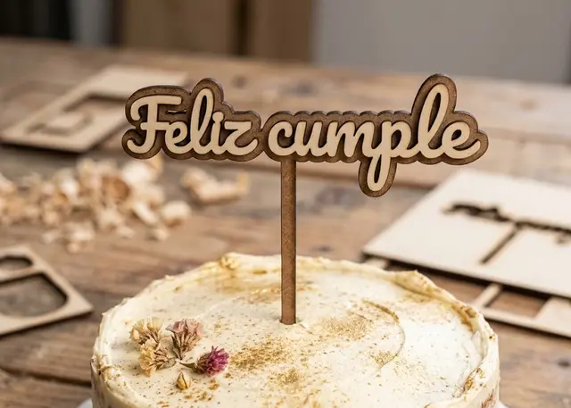
Cake topper Pro
A name with legs to stick into the cake, in one single piece so nothing falls off.
It joins the letters until the topper comes out whole, and the legs grow where there is material rather than in mid-air.
Not falling into the cake
It has to come out as a single piece. A keyring that breaks gets glued; a cake topper that breaks falls into the cake at the birthday party. If the warning about it coming out in pieces appears, do not cut it: raise the join, or turn on the baseline.
There are two ways to join the letters. Bringing them together until they touch, which a script font does well because they come linked already. Or with a line underneath crossing them all, which is the only thing that saves a print typeface: however close they get, the "o" is never going to touch the "m".
Several lines need to hold on to each other. One per row, and they centre themselves. But as well as the letters of each line holding together, the lines have to hold on to each other: lower the line spacing until they overlap — a script hooks onto itself — or add the backing layer, which joins them all.
With two layers it no longer matters whether anything touches. The backing shows behind as on the keyring and everything glues on top. It is the safest option, and it looks better in two woods, or painting one of them.
The dots on the "i"s are lowered until they attach. Neither the join nor the baseline reaches up there: both work sideways or from below, and the dot is up top and separate. It is moved down by just a few millimetres, which is what anyone would do by hand, and at a glance it passes for a well-attached dot.
Script fonts do far better. They need less join, come out finer and often do not need the baseline at all. If you are going to try one thing, try changing the font.
The legs do not go where you would think. Spread out by eye, on many names one lands right in the gap between two letters and hangs in mid-air. The template looks for the lowest point with material near it and grows them out of the letter. That is why they are sometimes not symmetrical: they end up where they hold.
Frequently asked questions
Cake topper: what size can it be?
Every measurement is typed in millimetres and the drawing is redone as you type: height, from 15 to 250 mm, join, from 0 to 20 mm and thickness, from 0.5 to 20 mm. Everything else — joints, dividers, holes — is worked out from those measurements.
Does it work for MDF, acrylic or plywood?
For any sheet your laser can cut: MDF, plywood, acrylic or thick card. What matters is the thickness, adjustable from 0.5 to 20 mm, and the kerf — what the beam eats away: the joints are drawn from those two numbers, so they push together without sanding.
What format does it download in?
SVG or DXF, your choice, in millimetres and at 1:1 scale. It opens as is in LightBurn, RDWorks, LaserGRBL, Inkscape, Illustrator or CorelDRAW, with nothing to scale or convert. Cutting and engraving come on separate named layers — “Cut” in red and “Engrave” in blue — so you set the power for each without separating anything by hand.
Do I have to pay to use it?
Cake topper is free to use and adjust: you can see exactly how your design will come out before deciding anything. Downloading the file needs the Pro plan, or one of the trial downloads that come with the free account.
Others you might need
-
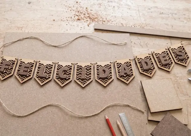 Bunting A garland of pennants in the shape you choose, with a polka-dot, diagonal or zigzag pattern and one letter on each.
 -
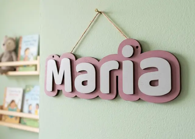 Door name sign A name to hang on a door: a one-piece backing and every letter loose, so you can paint each one a different colour.
 -
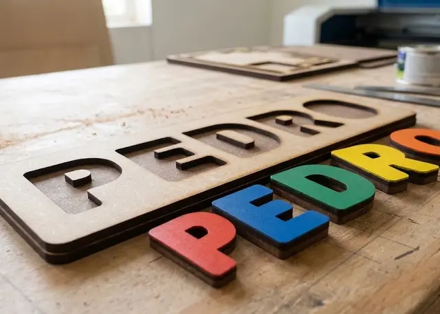 Name puzzle A board with the name cut out and every letter loose, to slot back in. It all comes out of one cut.